Liftoff
Shedbot 2.0 reflects a sharper focus on building for the web. The old website has been refined into a single page responsive layout with a small, select portfolio of web projects. The new site is lightweight, and progressively enhances for high pixel density "retina" displays with resolutions up to an absurd 5120 x 2880.
Load weight on mobile is 316K, 375K for mobile retina, 960K at largest non-retina breakpoint, and a respectable 1511K for widescreen retina.
The blog features responsive, full width images that are dynamically downloaded in 1 of 5 sizes depending on the user's screen resolution. Type is FF Tisa Web Pro and Proxima Nova, served by Typekit.
A Retina Web
There's no silver bullet approach to support a retina web, but as high pixel density displays become increasingly popular their support should be prioritized. Whenever the project allows, resources are better spent enhancing the user experience for those at the cutting edge of technology over patching fixes for non-compliant legacy browsers.
I'll outline the tools and methods I used to support high pixel density displays here in a blog post next week. In the mean time, let me know what you think of the new site.
Happy Thursday.

Brad Cerasani
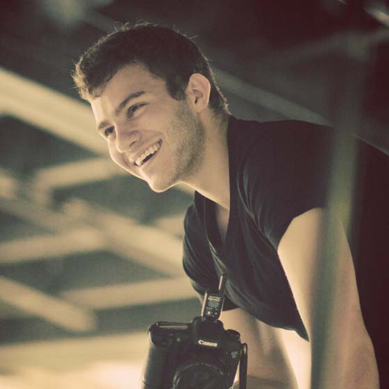
Brad is a designer/developer from Winnipeg, Manitoba. To get in touch follow @bradcerasani on Twitter or send him an email.